
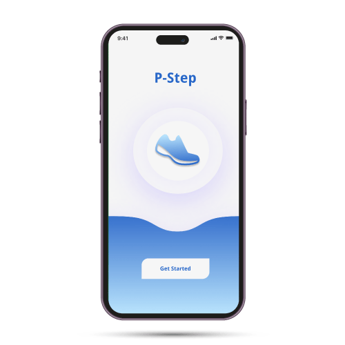
P-Step: Gamified Health & Mobility App
Role: UX Researcher & Product Designer
Organisation: Academic / Independent Project (MSc HCI)
Timeline: 4 months
Tools: Figma, FigJam, Miro, Usability Testing Tools, Adobe Illustrator, React Native
Context: Behavioural design, accessibility, gamification, usability testing
Overview
P-Step is a mobile health application designed to encourage walking and physical activity through gamification. The goal of the project was to explore how behavioural design, motivation, and feedback loops could be used to improve user engagement and long-term participation in physical activity.
The project focused on understanding user motivation, designing meaningful rewards, and validating whether gamified experiences could positively influence behaviour.
The Challenge
Through preliminary research, a core tension emerged:
Users needed structured mobility support and encouragement, but existing rehabilitation systems were clinical, static, and lacked motivation-driven feedback loops.
Key challenges identified:
Low long-term engagement with rehabilitation exercises
Limited real-time feedback outside of clinician sessions
Reduced confidence in mobility progression
Emotional barriers impacting consistency
The opportunity was to design a supportive digital layer that reinforced mobility behaviours in an accessible and empowering way.

Aims and Objectives
Identify and evaluate the most effective gamification strategies that can be implemented in a mobile health application.
Design and develop interactive user interface prototypes employing the identified gamification elements, material design components, and Figma.
Research & Insights
-
Users are motivated by clear goals, progress visibility, and rewards
Simple, achievable milestones outperform complex challenges
Visual feedback increases motivation and perceived progressed exercise regimens and advice for various diseases.
To explore this problem, I conducted:
User surveys and interviews to understand motivation and barriers
Competitive analysis of popular fitness and health apps
Literature review on gamification and behaviour change
Usability testing on early prototypes


Low-Fidelity Exploration
I began with low-fidelity wireframes to validate structure, interaction simplicity, and behavioural flow before investing in visual refinement.
The early prototypes focused on:
Clear goal-setting mechanics
Visible progress indicators
Lightweight milestone feedback
Minimal navigation depth
At this stage, I prioritised clarity over aesthetics, ensuring users could understand the system within seconds and navigate without cognitive strain.
Early walkthroughs helped surface friction points in task flow and highlighted the importance of simplifying feedback loops to avoid overwhelming users.

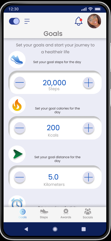
Information Architecture
The Step page: This page was connected to the goal page, award page and social page in the form of the navigation bar. It was also interconnected with overlays that contained the daily highlights.
The Goal page: This page like the step page makes use of the navigation bar at the bottom and a weight setting overlay.
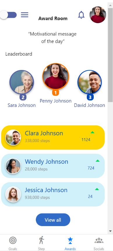
The Award page displays a limited number of badges which expands to the whole awards page that shows an extensive preview of rewards attainable. It also has a navigation bar for movement across the pages.
The Social networking page is by far the most extensive page with three (3) tabs that allow for the managing of the friend lists by adding or removing friends, information on shared steps and badges and information on nudges as well as the ability to nudge

Mid-High Fidelity Prototype
As the interaction model stabilised, I transitioned into mid- and high-fidelity prototypes to test tone, visual hierarchy, and emotional response.
Design refinements focused on:
Soft, encouraging microcopy
Accessible colour contrast and readable typography
Clear differentiation between progress states
Reduced visual clutter
Gamification elements were deliberately restrained. Rather than competitive scoring or complex reward systems, the experience is centred on personal progression and reassurance.
The visual system reinforced trust and calmness, avoiding overly playful or clinical extremes.


Usability Testing
Overview
This user study was conducted at the University of Leicester. It took place over the month of August 2022 and focused on the testing of an interactive prototype aimed at implementing gamification elements in the P-STEP project. Prototypes were tested with representative users to evaluate clarity, motivation impact, and ease of use.
Testing revealed:
Strong positive response to visible progress tracking
Increased perceived confidence in mobility progression
Preference for short, achievable daily goals
Sensitivity to overly complex reward mechanisms
Feedback and Recommendations
Based on feedback, I:
Simplified achievement displays
Refined milestone messaging to reduce pressure
Reduced the number of interaction steps
Improved hierarchy in progress visualisation
These iterations strengthened both usability and emotional resonance.
Interaction & Accessibility Considerations
Given the user group, accessibility was central:
Clear typographic hierarchy
Large tap targets
High colour contrast
Reduced interaction complexity
Minimal navigation depth
Design decisions prioritised clarity and reassurance over visual novelty.
Outcome & Impact
The project was adopted by the NHS-funded P-STEP initiative as part of continued exploration into digital rehabilitation support.
Key outcomes:
Validated demand for confidence-building digital support
Demonstrated feasibility of gamification in mobility contexts
Established a behavioural design framework for future development
Beyond the interface itself, this project strengthened cross-disciplinary collaboration between healthcare professionals and digital design teams.
Partial Implementation


I sought then to develop the application interface with react-native and more specifically the snack.expo.dev platform. The main aim of the partial implementation was to test the feasibility of the designed prototype in accordance with the material design 2 and 3 guidelines. The partial implementation could be considered the delivery aspect of the program.
Snack.expo is an online platform that allows the designing, running, and viewing of various applications in the form of web, android or IOS applications. It allows for collaborative development and the easy sharing of code when developing react-native applications.
Reflection
This project reinforced the importance of designing for emotional as well as functional needs — particularly in health contexts.
It strengthened my approach to:
Behaviour-driven product design
Accessibility beyond compliance
Iterative validation with vulnerable user groups
Designing systems that empower rather than pressure
The experience deepened my ability to balance motivation, usability, and sensitivity — a principle I now carry into all complex system design work.