

Craigslist Usability Redesign
Craigslist remains one of the most visited classified platforms globally, yet its interface has changed very little over the past two decades.
While its minimal structure supports speed and familiarity, the experience introduces usability friction during high-stakes tasks such as housing searches, job applications, and marketplace purchases.
This project evaluated Craigslist’s desktop experience and proposed research-led improvements to enhance clarity, task efficiency, and user trust without compromising its core simplicity.
The Problem and strategy
Users rely on Craigslist for important life decisions. However:
The homepage is text-heavy and visually overwhelming
Filtering tools lack prominence and clarity
Navigation relies on user familiarity
Trust signals are minimal in high-risk categories
This creates cognitive load and uncertainty, particularly for new users.
Role
UX Researcher/ Usability Researcher
Timeline
6 weeks
Tools
Craigslist.org website
Background, pre and post test queationnaire
SUS Document
The Craigslist Website
This is the initial view of the craigslist London website.A walkthrough of the site was initially conducted to access it’s features.

Research Approach
Methodology
Participants
Six participated worldwide.
3 males
3 females
Duration
The sessions were completed within approximately 30 minutes.
Location
Microsoft Teams
Zoom
Sessions
Pre-Sessions
Participants were chosen randomly and composed of friends or families of the tester.
Each individual was personally contacted and briefed on the project and was given the chance to agree or disagree to partake.
Each participant was briefed by the test administrator and a short background questionnaire was filled.
The participants were then given a chance to read the task scenarios and the test proceeded with the individuals trying to perform their tasks.
During Session
After each task, the participants were asked to rate the interface using a 5-point.
Likert Scale which ranged each section from “strongly disagree” to “strongly agree”. This was to measure 2 main variants:
• The ease of finding required information on the home page
• The ability to track one’s location at any point on the website
The overall experience on the website was measured using a 5 – point Likert scale testing eight measurement factors:
• Ease of use
• Keeping track
• Learnability
• Information aquisition
• Aesthetics
• Engagement
• Content Organisation
Post Session
Participants were asked to rate the experience of the test by stating what they liked most, and liked least, and recommend ways through which the website could be improved.
Tasks
The tasks were created to test specific touchpoints and interface functionalities of the website:
Test how to locate the contact number of a specific Company of interest or the information accessible to interested users.
Check how new users could create a posting on the platform.
Test the searching and deleting function of anonymous posts postings done with no account.
Test how to locate, use and read from the discussion forums or the discussion forum functionality.
Test a user’s ability to find a specific item posted on a specific day
Test the map feature
Results
Task Completion Success Rate
Most participants were able to complete the tasks without prompting.
Task 1 and task 4 - 100% completion rate
Task 2 - 66.6% completion rate
Task 3 - 0% completion rate
Task 5 and Task 6 - (66%) completion
Task Ratings
Ease in Finding Information
Most participants agreed that it was relatively easy to find information relevant to their search with an overall approval of 100%
Keeping Track of Location on the Site
Again, almost all participants found tracking their current locations on the page at a given time easy.
Time on Task
The completion rate ranged from 75 to 462 seconds and the results across showed task 4 as the fastest to be completed.
Task 3 took the longest as predicted as participants could not easily find their postings in order to delete them (mean = 330.3secs).
Errors
Video and audio medium was used to capture the frequency of errors such as
Menu choice error
Select from list error
Emotional expression of frustration
and confusion
Seeking help
Participants made the most errors in task 3.
Overall Metrics
• Ease of use - 83.3%
• Keeping track - 100%
• Learnability - 66.6%
• Information acquisition -66.6%
• Aesthetics - 0%
• Engagement - 0%
• Content Organisation - 33.3%
Key Insights
Weak visual hierarchy reduced scannability
Filtering options were underutilised due to low visibility
Limited feedback during navigation caused confusion
Trust cues were insufficient for high-risk transactions
Design Strategy
Rather than a full redesign, I focused on evolutionary improvements:
Strengthening information hierarchy
Improving filter visibility and logic
Enhancing typographic clarity
Introducing subtle trust indicators
The strategy balanced usability enhancement with platform familiarity.
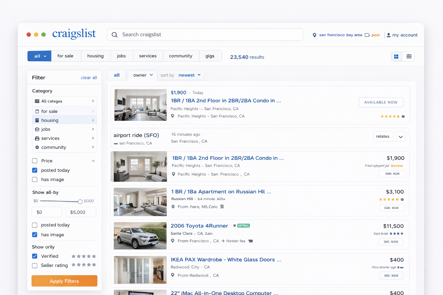
Proposed redesign based on findings
Clearer category grouping
Persistent and accessible filtering panel
Improved typographic scale
Contextual trust cues (e.g., verified listings indicators)
These changes aimed to reduce cognitive strain and improve decision confidence.
Summary and Conclusion
Craigslist is a widely used app and even though it has been labelled one of the worst websites in terms of interface, the study proved that it is easy to use. The entire interface of the website needs to be redesigned to look more attractive.The discussion forum must be recategorized
There should be help bubbles or dialogue boxes.
Craigslist needs more content monitoring and more design to increase its potential.