
P-Step: Gamified Health & Mobility App
Role: UX Designer
Organisation: Academic / Independent Project (MSc HCI)
Timeline: 4 months
Tools: Figma, FigJam, Miro, Usability Testing Tools, Adobe Illustrator, React Native
Context: Health, Behavioural Change, Mobile Application
Overview
P-Step is a mobile health application designed to encourage walking and physical activity through gamification. The goal of the project was to explore how behavioural design, motivation, and feedback loops could be used to improve user engagement and long-term participation in physical activity.
The project focused on understanding user motivation, designing meaningful rewards, and validating whether gamified experiences could positively influence behaviour.
I led the UX process end-to-end, from research and concept development through to high-fidelity prototyping and usability evaluation. My responsibilities included:
Planning and conducting user research and surveys
Carrying out competitive analysis within the health and fitness app market
Synthesising insights into personas and journey maps
Designing interaction flows and gamification mechanics
Creating high-fidelity prototypes
Running usability testing and analysing results
My Role
The Challenge
Research revealed that many existing health and fitness apps struggle to sustain long-term engagement. Users often:
Lose motivation after initial use
Find progress tracking unclear or unrewarding
Feel overwhelmed by complex interfaces
As a result, users disengage before forming consistent habits.

Aims and Objectives
Identify and evaluate the most effective gamification strategies that can be implemented in a mobile health application.
Design and develop interactive user interface prototypes employing the identified gamification elements, material design components, and Figma.
Research & Insights
-
Users are motivated by clear goals, progress visibility, and rewards
Simple, achievable milestones outperform complex challenges
Visual feedback increases motivation and perceived progressed exercise regimens and advice for various diseases.
To explore this problem, I conducted:
User surveys and interviews to understand motivation and barriers
Competitive analysis of popular fitness and health apps
Literature review on gamification and behaviour change
Usability testing on early prototypes


Low-Fidelity Prototype.
It took the form of a paper sketch indicating the main features of gamification and social interaction. The four (4) main pages were labelled:
Step Page: This contains the main real-time step count of the user. The page was to contain general information and information on progress.
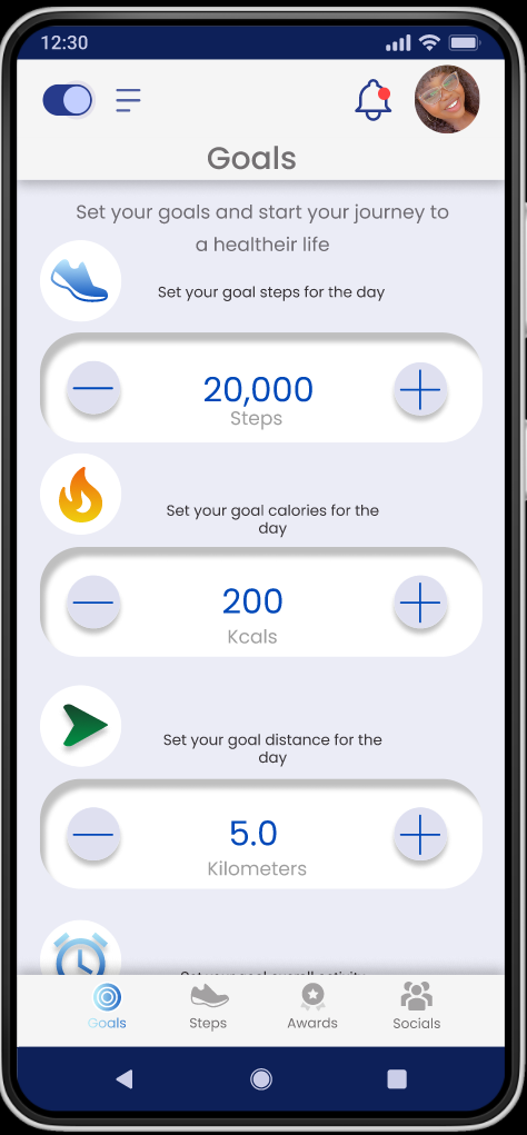
Goal Page: This enables users to set milestones of step count, calories, duration, and distance in order to meet specific goals.
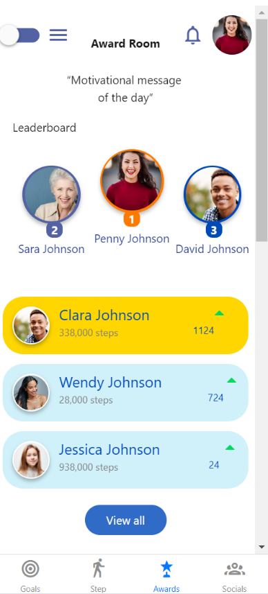
Award page: This was the page that contained all gathered awards and future awards that could be obtained.
Friend page: This page was the main social networking page.
The main game elements selected were:
Badges
Leader boards
Progress or status bars/indicators
Social features: sharing steps and awards, social interactions with friends.

Information Architecture
The Step page: This page was connected to the goal page, award page and social page in the form of the navigation bar. It was also interconnected with overlays that contained the daily highlights.
The Goal page: This page like the step page makes use of the navigation bar at the bottom and a weight setting overlay.
The Award page displays a limited number of badges which expands to the whole awards page that shows an extensive preview of rewards attainable. It also has a navigation bar for movement across the pages.
The Social networking page is by far the most extensive page with three (3) tabs that allow for the managing of the friend lists by adding or removing friends, information on shared steps and badges and information on nudges as well as the ability to nudge

Mid-High Fidelity Prototype
The design of the prototype was refined, and more features were added on. The number of pages increased from four (4) to about eight (8) with various additional features such as overlays added to pages to increase their interactivity. The addition of tabs in the social networking section allows for more features such as nudging friends into the network. The pages were named:
Awards
Badge share
Steps
Goals
And various overlays
Nudges
Friend list
Customized badges and awards were designed using adobe illustrator although they continue to serve as placeholders for the main badges to be designed for the gamification feature.


User Studies and Evaluation
Overview
This user study was conducted at the University of Leicester. It took place over the month of August 2022 and focused on the testing of an interactive prototype aimed at implementing gamification elements in the P-STEP project. This user study aimed to gather data pertaining to specific features of the prototype and determine the overall engagement and usability of the prototype. It examines overall factors of engagement such as:
Focused attention
Perceived Usability
Aesthetic Appeal
Endurability
Novelty
Felt Involvement
Participants
Due to the nature of the study, the main participants for the study were stakeholders involved in the P-STEP project. Four (4) participants were used in the study with one (1) being the pilot and three (3) performing the study after the pilot study findings were used to update the prototype.
Tool Selection
Consent Form: Used to acquire consent from participants.
Background questionnaire: Used to obtain key background information
Task: The tasks are designed to test the prototype pages and functions.
Task performance Form: used to collect more in-depth observable quantitative and qualitative data.
Interview and feedback questionnaire: Used to obtain a more detailed understanding of the designed prototype.
User Engagement Scale document: Standardised document for gauging user engagement of applications and websites.
Interactive prototype.
Location
This study was performed online via Microsoft teams as it was the most convenient for all parties involved. It was also most efficient in obtaining word-for-word descriptions in the form of the Microsoft Teams transcript function and a recorded version of the test.
Duration
The test duration was initially predicted to be sixty (60) minutes and was modified after the pilot study and various technical problems were solved to be less than forty-five (45) minutes.
Findings
At initial introduction to the four (4) main pages, step, goal, game, and friend of the interface designed, all or 100% of participants were able to identify what each page was meant to do. After identifying the general layout of the application, they went ahead to perform the tasks provided.
Using the table below, the summary of the results and data collected as far as task completion, time on task, error and satisfaction were collected. Satisfaction was calculated as the mean across the post task question ease of finding and ease of tracking.
-
According to the data collected, all participants were able to complete all tasks allocated to them with a 100% success rate. This proves that all functionalities of the application are visible and navigation to correct mistakes are available.
-
Overall participants did not seem to struggle too much even though there were notable errors and frustrations the post task questions asked varied in relation to the errors.
-
The time taken to complete each task was noted and the average time on task for each task was calculated. From the data collected the lowest amount of time was spent on the first task (20.42 secs) and the most amount of time was spent on the last task (99.06 secs). Every task that surpassed an average of 30 secs to complete was flagged as potentially problematic inculcating task 3, 5 and 6.
-
The satisfaction metric was calculated as the average rate of the Likert scale from 5- being the strongest in agreement to 1-being the strongest in disagreement across all tasks. There were 2 metrics used, the ease of finding information and the ability to track location at any point in time. Any task below the scale of four (4) could be deemed unsatisfactory flagging task 3 and task 6 as the most unsatisfactory with an average rating of 3.8 and 3 respectively.
Discussion
All participants have used applications that have gamification features before. This could affect how their results could translate to a larger audience of the desired target group.
The results acquired may not be deemed applicable to newer non-stakeholders as their response would vary vastly from those achieved.
Participants seemed to focus more on the usability and aesthetics of the application than on the other elements of engagement such as novelty and endurability.
Participants did not seem to find the navigation of the application too difficult. They also found the application to be aesthetically pleasing and overall quite usable.
The participants did not seem to lose themselves completely in the experience and this could be attributed either to continuous communication with the researcher or the outside world.
This study only had 3 participants and the only apparent conclusion that could be drawn from the study is that given enough time all participants eventually complete their tasks.
Feedback and Recommendations
“The categories and awards showing was good”
“Goal setting was good, and it was good to have the options. The rewards are motivating and encouraging to choose and the overview of everything done in a day was encouraging. the nudging feature was great.”
“The foot page puts useful information on the front page, and you can get to every page from the page. The app is simple and wouldn’t mind using everyday”
Participants also had their grievances and things they would have preferred to be done differently or changed stating factors such as:
“Goal page archaic and the weight can’t be edited, duration and weight, too simple and archaic. The overall progress is hidden far away, so it needs to get more tabs for monthly and yearly progress.”
“Manually adding the weight could be problematic so maybe connect to another health app”
“Icons are big, bottom icons, goals icons can be changed, change share icon and write description below.”
Partial Implementation


I sought then to develop the application interface with react-native and more specifically the snack.expo.dev platform. The main aim of the partial implementation was to test the feasibility of the designed prototype in accordance with the material design 2 and 3 guidelines. The partial implementation could be considered the delivery aspect of the program.
Snack.expo is an online platform that allows the designing, running, and viewing of various applications in the form of web, android or IOS applications. It allows for collaborative development and the easy sharing of code when developing react-native applications.
Conclusion
As there was no extensive development in the way of implementation, the future recommendation would be the full implementation of the design. The vigorous testing of this fully implemented application with a larger sample size over a longer period of time would be a more accurate determination of the engagement a retention power of the designed prototype. This project shows a lot of promise and if properly implemented could change the lives of its users as it sets out to do. This project thusly accurately, discovers, defines, develops, and delivers a comprehensive understanding of user engagement retention of the P-STEP project using Gamification Strategies or Social Networking Features.